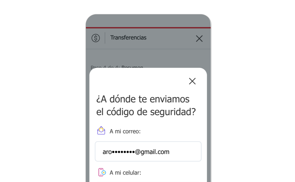
In 2019, Scotiabank Colombia faced a critical challenge: the identity verification process, or one-time password (OTP), was causing a significant drop-off in user engagement and affecting product offerings. With a 77% decline in users verifying their identity via text message, the performance of online banking and sales flows was at risk. This case study details how I worked and solved the issue by improving conversion rates.
The Challenge
The OTP process is crucial for verifying identity during transactions or when accessing protected areas in personal banking. However, the not-so-friendly nature of the process and a bad UX were leading to a significant user drop-off.
The Goal
The goal was to come up with a plan to reduce user drop-off during the OTP process and implement the solution. This involved identifying and addressing the usability issues and creating a seamless verification process for the customers.
My Role
As the UX Lead for Sales and Onboarding, I partnered and collaborated with my peer; the Lead of Online Banking and our manager Head of Design on this challenge, since all our products were seriously impacted by the issue 🔥. My role required coordinating sessions with various stakeholders, including product owners, compliance team, and technical developers to gather information and propose solutions.
User Research
To begin this project, I thoroughly examined all available data from end to end to confirm and define the scope of the optimization, which initially focused on redesigning the OTP module.
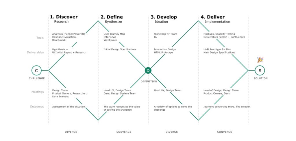
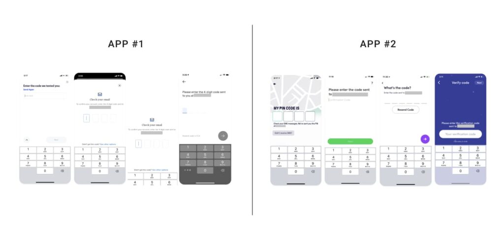
During the discovery phase, I benchmarked various digital platforms to gain a deeper understanding of what was and wasn't working and identify opportunities for improvement.
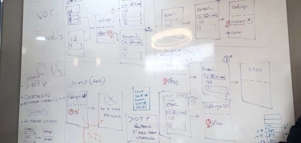
Research also included meeting with the product teams and other designers multiple times to gather ideas and hypotheses for the solution.
Despite the short execution window we had (this was a fire!), we were able to conduct interviews, usability tests, and more in record time. We also wanted to understand how users perceived the security measure of receiving a code on their mobile phone during a transaction or while opening a new product.
Pain Points
According to our research, we found that the pain points varied significantly among user segments. Some examples include:
- 1
Confusing numbers: Users were unsure which number to enter, often confusing the OTP code in their phones with the phone number that sent the code.
- 2
UI/UX issues: Some users perceived the OTP as an error or thought they had accidentally left the flow. There was an opportunity to provide clearer contextual information.
- 3
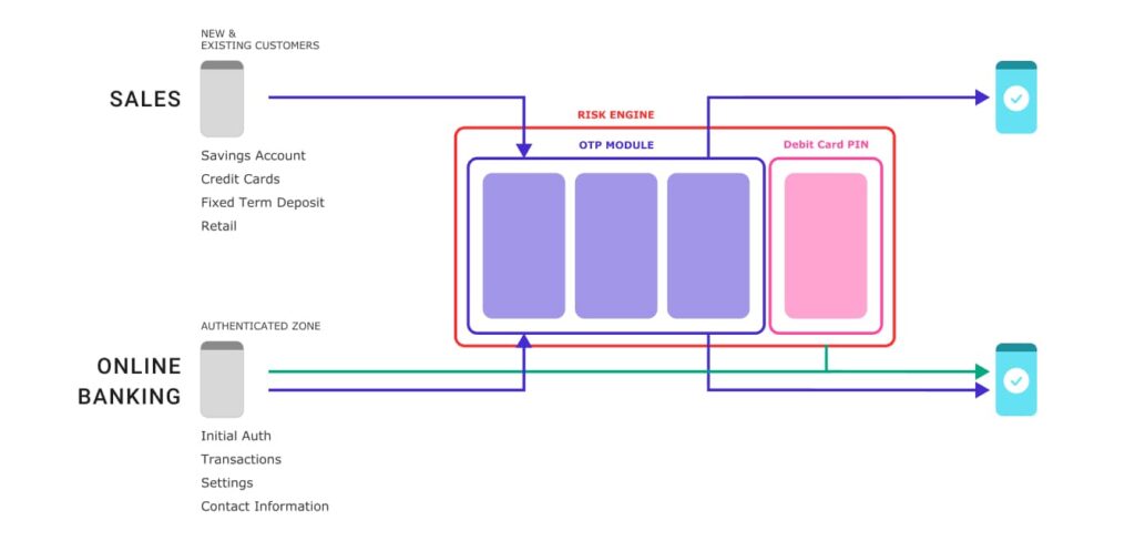
Trust in online security screens: In some cases, the risk engine displayed an additional screen alongside the OTP, prompting users to enter the PIN of their debit card. This caused confusion and suspicion among some user

These findings highlighted the need for a more intuitive and transparent verification process that would build user trust and improve conversion rates. Furthermore, I also conducted usability testing in multiple phases (low-fi and hi-fi) to gather user feedback and refine the proposed designs.
The Design
One of the major challenges we faced was finding a way to integrate the OTP seamless into any flow and make it almost part of whatever the user was experiencing. This was challenging due to the dynamic nature of the risk engine and dozens of different security policies.
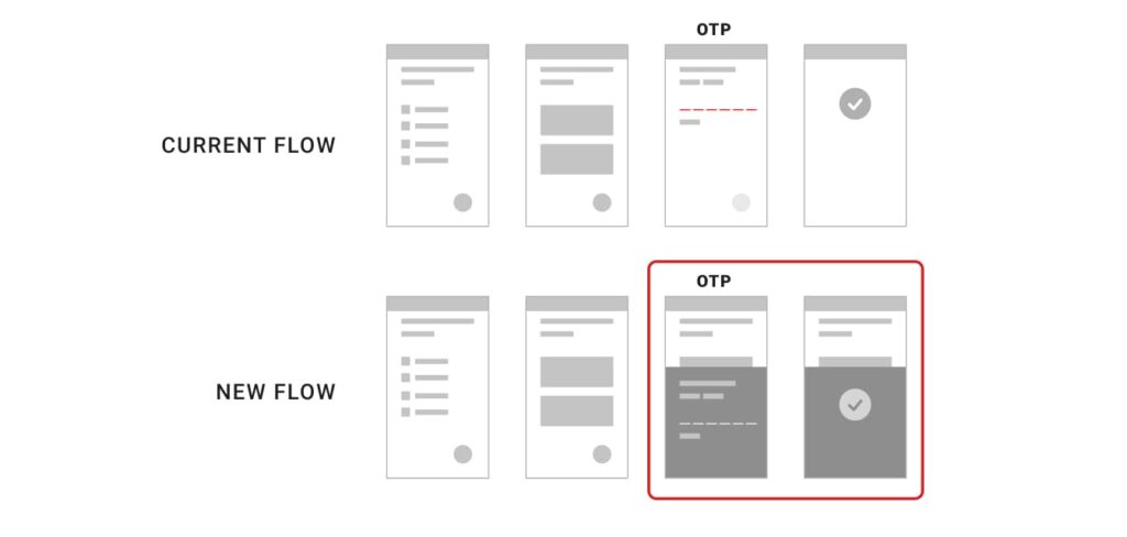
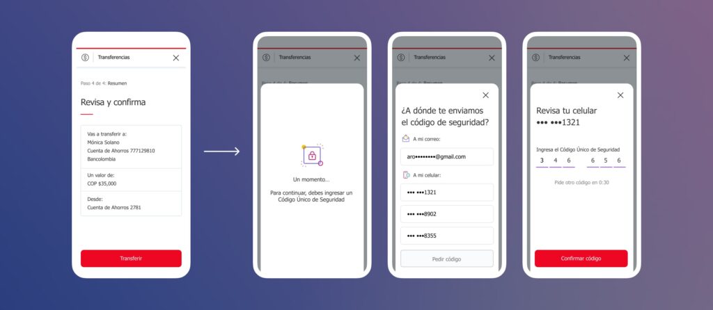
To address this, we implemented a new in-context component we called the Bottom Sheet. We also iterated on the design multiple times to achieve the best possible experience for our mobile and desktop users.
To divide and conquer the tasks, my peer created the UI using Sketch (we migrated to Figma in 2020) while I developed the hi-fi interactive prototype for a second round of UT using HTML.
I worked on the HTML and CSS code using Bootstrap. It wasn't my first time styling Bootstrap, and I already had a few similar experiments in Codepen, so the coding was easy and relatively quick for me. The prototype was responsive so we could test it on desktop and mobile.
Just a day before the usability testing, I added a preloading animation using After Effects to enhance the prototype.

Refining the design required extensive discussions with the Product Owners, Stakeholders, and team members. Regulatory requirements of the MVP presented challenges, but through negotiation and patience we overcome them!
Takeaways and Learnings
- 1
One of the key learnings from this project was the importance of having the right copy. Since it was crucial to deliver a clear and concise message to users, we worked with the Content Team to create the best copy for the contextual information.
- 2
We also discovered that some users did not find it convenient to receive the code on their phone. To improve the user experience, we developed a secondary option of sending a one-time code directly to the user's email. Win-win!
- 3
Another lesson learned was that creating and implementing a component from scratch increased the risk of missing deadlines (and my anxiety levels!). I presented the engineering team with an alternative that involved using a regular container within the main template. In the meantime, I closely monitored the progress to ensure that we met the deadline for releasing the OTP with the Bottom Sheet, which we successfully did.
In the time following the release, I tracked the performance of the new OTP and the results were impressive. Not only did we meet the requirement of reducing user drop-off, but we also improved the experience and laid the foundation for many ongoing product redesigns at the bank.
