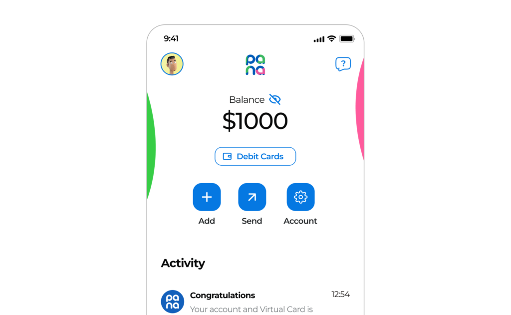
Pana, which means "Pal" or "Buddy" in Spanish, is a mobile banking app designed specifically for Latinos living in the US. Back then, we planned to offer a range of financial services, including bank accounts, money transfers, and Visa debit cards. What set Pana apart was its social banking features, allowing users to connect with like-minded individuals and build communities, making it easier for them to navigate the financial landscape and achieve their financial goals faster.
The Challenge
Three in ten Latinos living in the US are unbanked or underbanked due to various reasons like lack of documentation, language barriers, and high fees. This makes managing finances, paying bills, and sending money back to families a significant challenge. The goal was to create a digital solution that would overcome these barriers and provide accessible, affordable banking services.
The Goal
Pana aimed to allow latinos in the United States to open a bank account 100% online and easily transfer money overseas.
My Role
As the Lead Design Consultant, I led the design process for Pana’s MVP. This involved hiring an in-house Product Designer and conceptualizing design ideas, creating wireframes, producing high-fidelity mockups, and collaborating on the app's development. My role required strong design leadership and management skills to coordinate with stakeholders and the team.
User Research
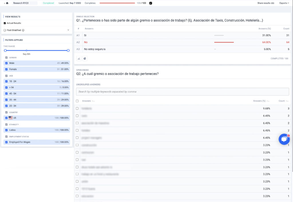
The initial purpose of the research was to gather insights and understand the needs of latinos living in the US. To validate the initial hypotheses, I conducted two surveys with a total of 100 participants each and also interviewed stakeholders and target users. One of the key findings from this research was a need for financial features such as salary advance and also the ability to send money overseas and pay expenses for relatives back home.
In addition to these financial needs, the research also revealed a desire for social banking features such as a live chat function. As a result, users would be able to get personalized support (not advice), build communities around common financial goals, such as saving clubs, and share their experiences and tips online, especially with newcomers.
Research Activities
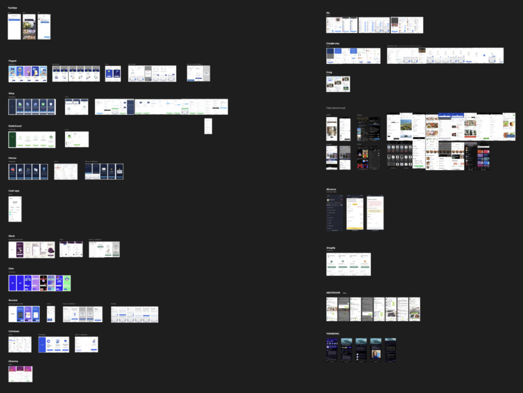
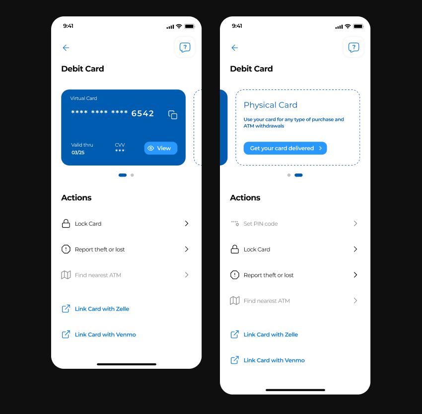
I conducted a benchmarking study that included mainly the four major competitors in the US: Majority, Seis, MyBambu, and Revolut. In general, this study helped us shape the initial Information Architecture of the app and provided us with a landscape view of the features it should have from day one, such as virtual debit card, integration with the digital wallets Zelle and Venmo, bill pay, check deposit, etc.
User Pain Points
- 1
Many immigrants do not have the necessary documents to open a traditional bank account, such as a Social Security number or a driver's license.
- 2
Since some immigrants do not speak English fluently, it's extremely difficult for them to communicate with bank employees or understand complex financial documents.
- 3
Living in areas with few or no physical bank branches makes it difficult for them to conduct in-person transactions
User Personas
Natalia
Age 35
Occupation Retail Sales and Bartender
Salary $4,500 / month
Time in the US 2 years
Nationality Mexico

I just want to be able to pay my bills and send money to my family without having to rely on someone else to do it for me. It's hard when you don't have a bank account
Goals
Getting all of her bills paid on time. Being able to save some money for emergencies.
Frustrations
Not being able to speak English fluently is making it hard for her to get things done.
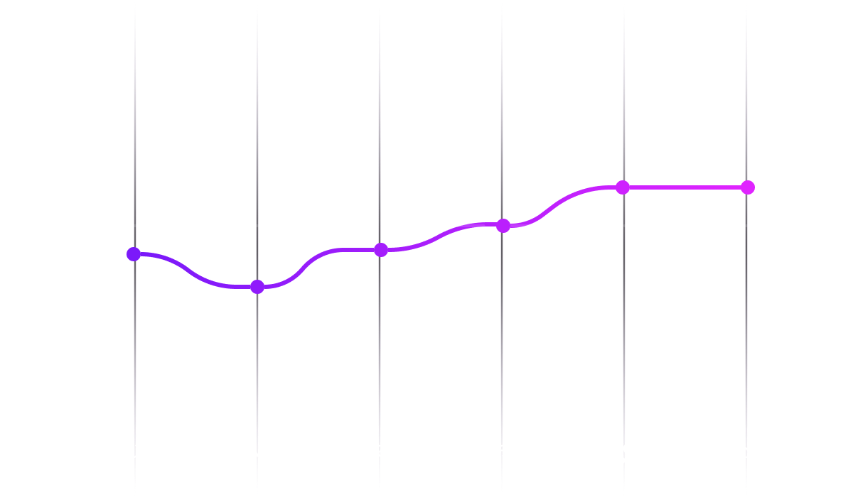
Journey / Satisfaction Map
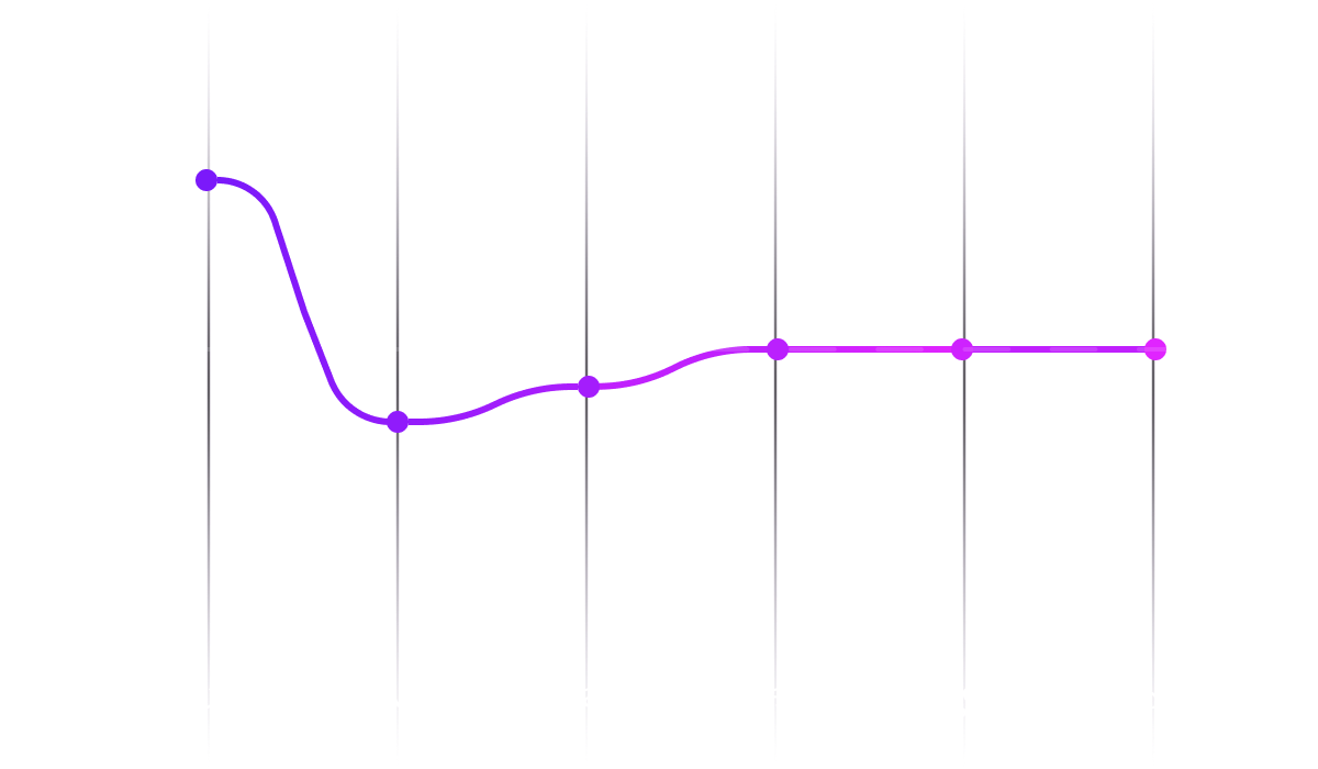
Carlos
Age 40
Occupation Construction Worker
Salary $3,200 / month
Time in the US 5 years
Nationality Guatemala
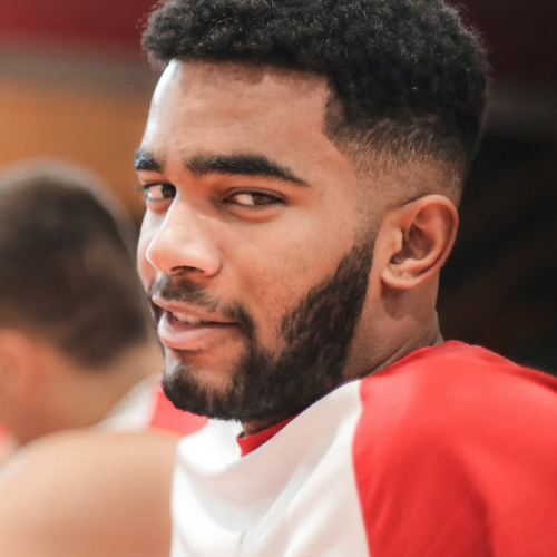
I work hard to support my family and send money to them every month. It would be great to have a simple and reliable way to do this without the high fees
Goals
Sending money back home with ease and paying all his bills on time.
Frustrations
The high fees associated with sending money abroad. Lack of access to affordable banking solutions.
Journey / Satisfaction Map
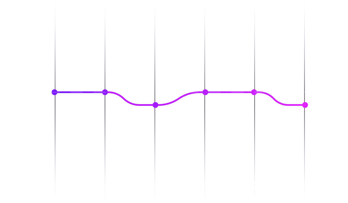
Ana
Age 44
Occupation Homemaker
Salary Variable
Time in the US 4.5 years
Nationality El Salvador
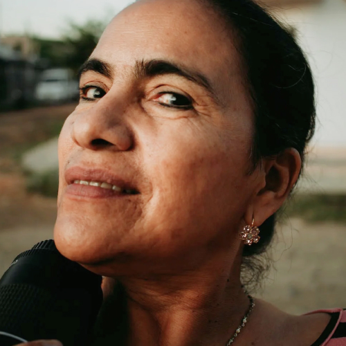
I want to switch to a new bank account because my current one has high monthly fees and I want to be able to send money to my family back home more easily and affordably
Goals
Ana wants to open a bank account that has less monthly fees and allows her to send money to her family in El Salvador from her phone.
Frustrations
Ana does not speak English fluently and is intimidated by the process of opening another bank account 100% online and sending money from her phone.
Journey / Satisfaction Map
The Design
Since my design goal was to create a financial app for Latino immigrants in the US, I started exploring options that considered the unique needs of this demographic, such as potential lack of access to certain documents at the moment (i.e. asking for documents that will terminate a flow) and connectivity issues when doing remote jobs, among other factors.
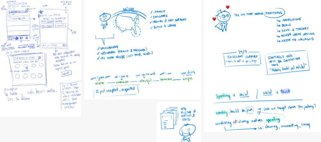
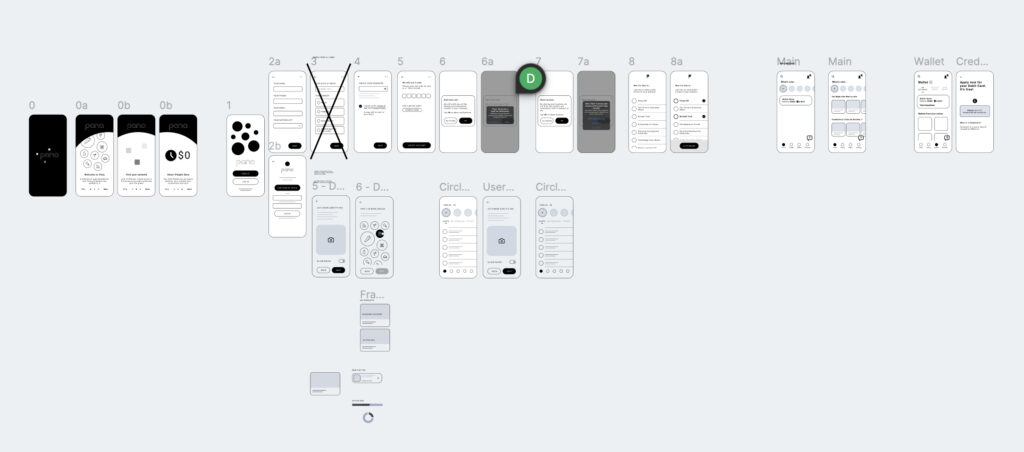
In order to make the app as straightforward as possible, I began the design process by creating wireframes for the primary user flows to gather early feedback and help me refine the design as quick as possible.
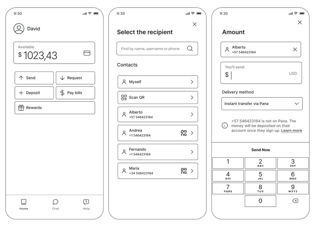
Once I had enough evidence to support some of the assumptions, I started drafting the Information Architecture for the MVP, which had to be intuitive and easy to navigate, supporting key features like account overview, transactions, bill pay, and money transfers.
In parallel, I built the first iteration of the component library for Pana which was used to further test primary user flows using hi-fi mockups instead of wireframes. These advanced prototypes focused on core features from the MVP.
Takeaways and Learnings
- 1
Convenience: Users value the ability to manage finances from smartphones without visiting physical branches.
- 2
Affordability: Providing low-cost banking solutions can significantly reduce financial burdens.
- 3
Supportive community: Since market research found that latinos place a high value on being able to discuss financial matters with family and friends in person or even a chat setting, we built the communities feature to help them navigate their financial journey supporting their strong sense of community that is prevalent in the culture.
- 4
Bilingual services: Additionally, many latinos may not feel comfortable managing their financial needs (direct deposits, checks, remittances, etc.) in English, and being able to do so in their native language allows for a more seamless and efficient process.
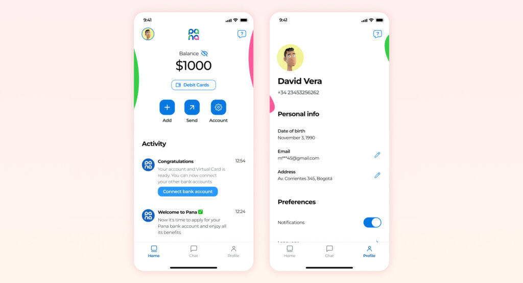
By focusing on these aspects, Pana successfully launched a user-friendly and inclusive banking solution for the Latino community in the US.
