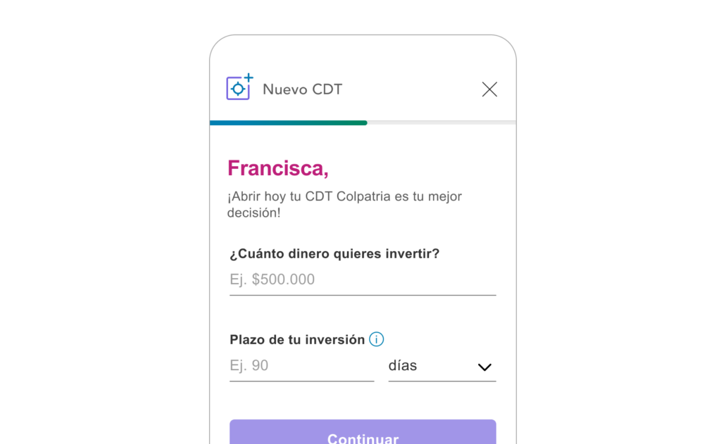
In 2018, Scotiabank Colombia faced a significant UX Design challenge: the process for opening Guaranteed Investment Certificates (GICs), or "Certificados de Depósito a Término" (CDTs) as they are known in Spanish, was entirely manual. Customers had to visit a branch, a time-consuming task that often took up to two hours. As part of the bank's digital transformation efforts, my product team was tasked with creating an online process for opening the new guaranteed deposits. Here's how I transformed a painful process into a seamless digital experience.
The Challenge
The process to open a GIC was far from user-friendly. In 2018, the lack of a digital option meant customers had to visit a physical branch, wasting time and dealing with extensive paperwork.
My initial user research revealed that the existing process was not only time-consuming but also inaccessible to many potential customers.
The Goal
The objective was clear: enable both new and existing customers to open GICs online, from any location, at any time. This would not only enhance user convenience but also align with Scotiabank’s broader digital transformation goals.
My Role
As the Senior User Experience Designer for this product, my responsibility was to design an end-to-end experience that balanced user needs with business goals. This involved extensive user research, prototyping, and iterative design. My role required me to coordinate with various stakeholders, including the product owner, compliance team, directors and devs.
User Research
To understand our target audience better, I collaborated with the bank's research team. We developed hypotheses and conducted comprehensive user research, which included:
- 1
Benchmarking: We analyzed 15 financial institutions in Colombia and 15 globally to understand industry standards and best practices.
- 2
Interviews: Conducted with existing and potential customers to gather qualitative insights.
- 3
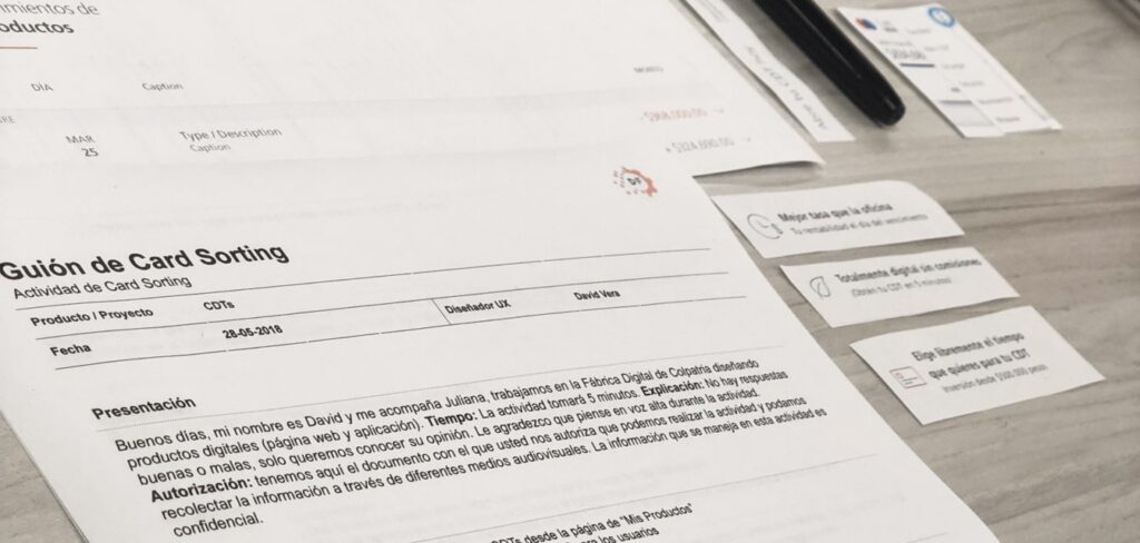
Card Sorting: To understand the mental models and preferences of users.
- 4
Data Analysis: From the Bank and public data from the market.
One key finding was that customers did not always choose the bank with the highest interest rates. Instead, other factors like trust, convenience, and accessibility played significant roles in their decision-making.
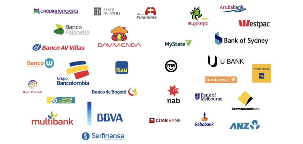
Research Activities
Benchmarking: The offerings of 30 financial institutions, both domestic and international.
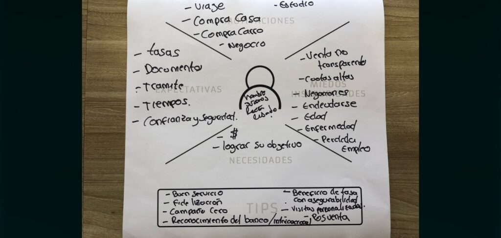
Customer Interviews: Revealed that time, accessibility, and ease of use were critical pain points. Empathy maps and user personas were developed to capture these insights. These tools were instrumental in creating a user-centric design that addressed real customer needs and preferences.
Card Sorting: Helped me understand users' mental models and preferences for financial products. This activity was important for developing an intuitive information architecture that aligned with users' expectations.
Data Analysis: Access to data from the current offline product and the market provided valuable insights. This approach ensured that the design decisions were backed by solid evidence.

User Personas
Manuel
Age 46
Occupation Sales Manager
Salary $3,000 USD / month
Financial Products Credit Cards, Chequing Account, Mortgage, Fixed Deposit

I don't care which bank offers this product, it's the interest rate that matters here
Goals
Profitability is this person's primary concern. He is always looking for the best interest rates at different banks.
Frustrations
The lack of simulators and comparison tools for all banks, along with personalized service and custom alerts for his investments.
Journey / Satisfaction Map

Gloria
Age 57
Occupation Accountant
Salary $1,500 USD / month
Financial Products Credit Cards, Chequing Account, Savings Account

I have to save for my son's college education, and because I do not have a saving culture, I need to force myself to stay away from my savings
Goals
She wants to save money on a regular basis and keep it away from her regular expenses.
Frustrations
Debt makes it very difficult for this person to save or invest.
Journey / Satisfaction Map

Lorena
Age 29
Occupation Psychologist
Salary $1,600 USD / month
Financial Products Credit Cards, Chequing Account, Savings Account

Saving is something my parents always taught me. Even if you don't make a lot of money, your savings are in good hands at the bank
Goals
Growing her savings. Making her saving process automatic.
Frustrations
This person doesn't like wasting time on something that should be online and take a few minutes.
Journey / Satisfaction Map

Findings and Insights
The research identified three major pain points:
- 1
Time-Consuming Process: The lengthy branch visit was a significant barrier in terms of convenience and accessibility.
- 2
Withheld Funds: Customers were frustrated by their inability to access funds before maturity and this opened up the opportunity to create and offer a new product.
- 3
Extensive Paperwork: The complexity of the paperwork made the process seem unnecessarily complicated.
In general, many users found the existing process daunting due to the lack of digital options and the high reliance on physical paperwork.
UX Design
Armed with these insights, I began the design process. The initial phase involved creating wireframes based on a list of features and content gathered during the research.
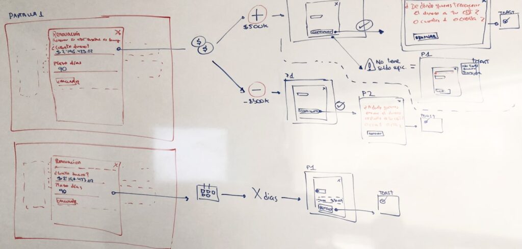
Wireframes: Focused initially on the mobile version, as I found evidence that most users would access GICs via smartphones.
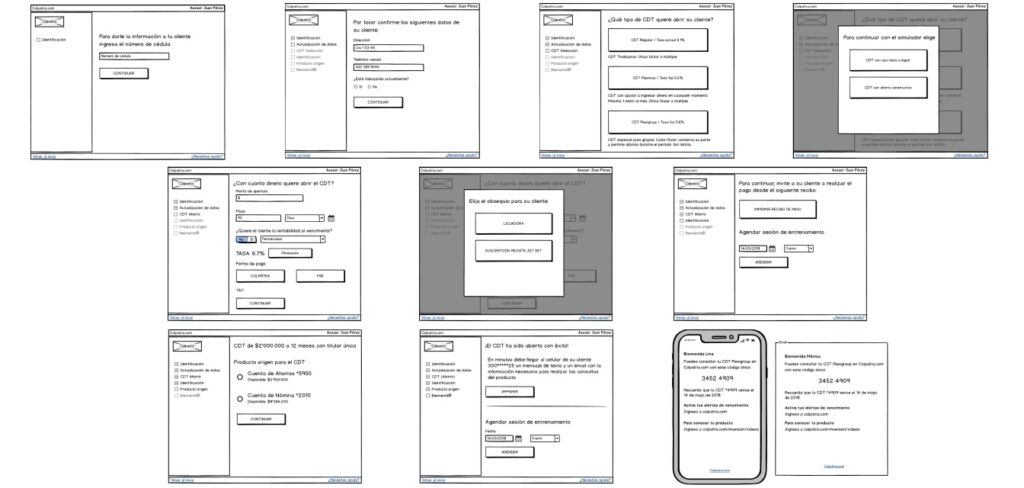
Prototyping: Usability testing was divided into three parts: opening, product information, and renewal/termination. Each part provided context to participants before assigning tasks.
The Process
Refining the design required extensive discussions with the PO, stakeholders, and team members. Regulatory requirements of the MVP presented challenges, but through negotiation and collaboration, we managed to optimize the process significantly.
I leveraged the design on the Component Library to ensure consistency and scalability across the platform. By reusing existing components and interactions, I ensured that my product could be easily maintained and updated.
Key Takeaways and Learnings
- 1
High interest rates are not the primary consideration for most users in Colombia. Instead, immediate benefits such as instant prizes were more influential/important.
- 2
Simulators are essential for users to determine interest rates and profitability before opening the product.
- 3
Low investment amounts attracted more customers, presenting a valuable marketing opportunity.
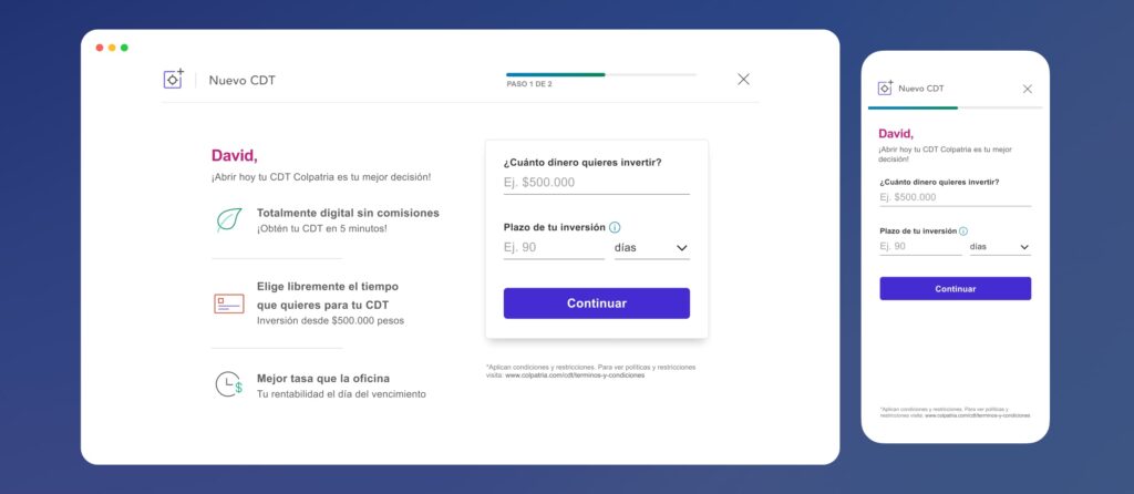
The MVP launch exceeded our customer acquisition goal by 32.5% in the first month. This success was largely due to my focus on user experience from the beginning. Marketing also played a big role, we partnered with them and employed innovative methods like offering food vouchers to the first 150 customers opening up for a GIC. This proved highly effective for our goals.
